float
The float property moves an element as far as possible to the left or right and allows content to wrap around it. Think of it like the 'floated' items are popped out of the stream, sticking out and letting everything else continue around it as normal.
Note that the floated element is placed within the content area (inner edges) of the paragraph or element that contains it. It does not extend into the padding area. Margins are also fully maintained for a floated element.
 float: none
This is an example. The float property moves an element as far as possible to the left or right and allows content to wrap around it. Think of it like the 'floated' items are popped out of the stream, sticking out and letting everything else continue around it as normal.
Note that the floated element is placed within the content area (inner edges) of the paragraph or element that contains it. It does not extend into the padding area. Margins are also fully maintained for a floated element.
- float: left
The float property moves an element as far as possible to the left or right and allows content to wrap around it. Think of it like the 'floated' items are popped out of the stream, sticking out and letting everything else continue around it as normal.
Note that the floated element is placed within the content area (inner edges) of the paragraph or element that contains it. It does not extend into the padding area. Margins are also fully maintained for a floated element.
- float: right
The float property moves an element as far as possible to the left or right and allows content to wrap around it. Think of it like the 'floated' items are popped out of the stream, sticking out and letting everything else continue around it as normal.
Note that the floated element is placed within the content area (inner edges) of the paragraph or element that contains it. It does not extend into the padding area. Margins are also fully maintained for a floated element.
Floating Text Elements
Note some special points about floating text. First, you must provide a width property for it not to simply expand to fill the full width before wrapping. Next, though usually inline text doesn't keep top/bottom margins, for floated inline text, all the margins are retained like normal. Floated elements also stay below any other elements they are placed below in the HTML.
#inline-text-float {
  float: right;
  width: 200px;
}
Note that the floated element is placed within the content area (inner edges) of the paragraph or element that contains it.
This is an example continued. The float property moves an element as far as possible to the left or right and allows content to wrap around it. Think of it like the 'floated' items are popped out of the stream, sticking out and letting everything else continue around it as normal.
clear
To make it so that an element ignores any floats, so it doesn't wrap around the float and just starts on a new line like usual, use this property.
- none
- left
- right
- both
Example
 This is an example. The float property moves an element as far as possible to the left or right and allows content to wrap around it. Think of it like the 'floated' items are popped out of the stream, sticking out and letting everything else continue around it as normal.
clear: left
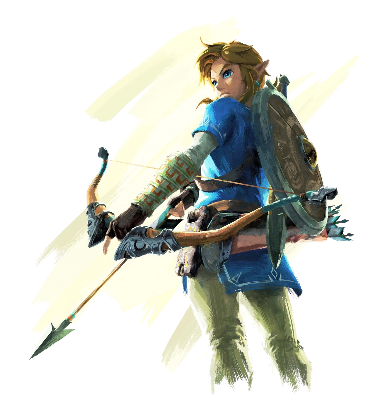
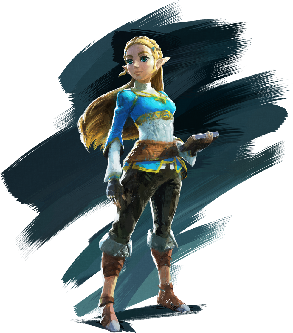
Note that this paragraph does NOT wrap around the floated image of Link, which is on the left, unlike the paragraph above us. However, it still wraps around the Zelda image on the right. The 'clear: left' attribute makese it so the header ignores link's float properties and does not wrap around him, but does not ignore zelda's float properties since she is on the right.
<hr style="clear: both">
Containing Floats
By default, floats are designed to 'hang out' of the element they are contained in. For example, there may be a heading, link, and image within a paragraph container. If you float the image to the left, the border of the paragraph will no longer expand enough to include the image within it.
If you float every object in the div, the border and background are now almost completely not-visible, containing none of the floated elements within it.
Containing Floats: Solutions
-
Steps:
- Use the :after pseudo-element to insert a character space after the container.
- Set its display to "block".
- Clear is on both sides.
Clearfix Solution
Legend of Zelda: Breath of the Wild#clearfix:after { content: " "; display: block; clear: both; } -
Steps:
- Float the containing element.
- Give the containing element a width of 100%.
Floating Container Solution
Legend of Zelda: Breath of the Wild#container { float: left; width: 100%; } -
Newest Option
The latest option that may soon replace the previous techniques is the 'display: flow-root' property. Note that this disables collapsing margins between the element and its first/last child.
flow-root Solution
Legend of Zelda: Breath of the Wild#container {display: flow-root; }
shape-outside
This property only works on floated elements for now, but this may change in the future. This property can work on text elements too, not just images.
- circle()
- ellipse()
- polygon()
- url()
Transparent Image
 In Chrome and Opera, this style has strange behaviors. The browser restricts the use of the image used to create the CSS shape if it isn't on the same domain as the file requesting it. This also means that compliant browsers won't allow images to be used for shapes when the files are served locally, like from your computer. They must be uploaded to a server to work.
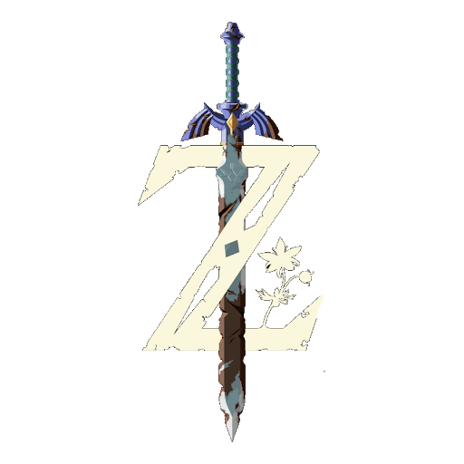
<p><img src="media/sword.png" class="transparent-wrap" alt="sword"></p> img.transparent-wrap { float: left; width: 300px; height: 300px; -webkit-shape-outside: url(media/sword.png); /* prefix required in 2018 */ shape-outside: url(media/sword.png); -webkit-shape-margin: 1em; shape-margin: 1em;-
shape-outside: circle(200px)
This is a test. We are checking how to create a circle padding shape for this image. This text should wrap around the image to the left by starting where the edge of the invisible circle padding ends. However, this 'path shape padding' does not actually change the fact that the image itself is still a square element, and filling the background and border shall still only fill the square space that the element occupies. This seems to work! Oh happy day. These effects work by letting the surrounding elements bleed into the image's bounding box. It will not make the image's bounding box bigger to 'push out' the margins. Make sure you are 'taking bites out' of the floating item.
-
shape-outside: ellipse(rx ry at x y)
This is a test. We are checking how to create a circle padding shape for this image. This text should wrap around the image to the left by starting where the edge of the invisible circle padding ends. However, this 'path shape padding' does not actually change the fact that the image itself is still a square element, and filling the background and border shall still only fill the square space that the element occupies. This seems to work! Oh happy day. These effects work by letting the surrounding elements bleed into the image's bounding box. It will not make the image's bounding box bigger to 'push out' the margins. Make sure you are 'taking bites out' of the floating item.
-
shape-outside: polygon(0px 0px, 120px 0px, 120px 20px, 130px 50px, 150px 50px, 130px 100px, 150px 150px, 120px 150px, 120px 200px, 0px 200px)
This is a test. We are checking how to create a circle padding shape for this image. This text should wrap around the image to the left by starting where the edge of the invisible circle padding ends. However, this 'path shape padding' does not actually change the fact that the image itself is still a square element, and filling the background and border shall still only fill the square space that the element occupies. This seems to work! Oh happy day. These effects work by letting the surrounding elements bleed into the image's bounding box. It will not make the image's bounding box bigger to 'push out' the margins. Make sure you are 'taking bites out' of the floating item.
shape-outside: polygon(0px 0px, 120px 0px, 120px 20px, 130px 50px, 150px 50px, 130px 100px, 150px 150px, 120px 150px, 120px 200px, 0px 200px); - This is an example of a [static] position element. This is the default position, and it behaves within the normal flow.
- This is an example of a [sticky ] position element. This functions like a combination of relative and fixed positions. It behaved as though relatively positioned, until it is scrolled into a specified position relative to the viewport. It then remains fixed. If it is contained within another element, the sticky will die once the user scrolls out of the container as well. Test it out here by squishing the page, then scrolling down.
- This is an example of a [fixed] position element. It stays on one 'fixed' point in the viewport no matter the place the user is scrolled to in the window.
- This is an example of a [relative] positioned inline element. The element is moved relative to its original position, from the top-left corner. Note that the space it originally occupied is still 'occupied' in that nothing else can move in to fill up the space left behind. These relatively positioned elements can also overlap other elements.
- This is an example of an [absolute] positioned inline element. The element is moved relative to its 'containing block', which in here is the viewport. It works a bit more flexibly than relative positioning. The space originally occupied is now filled in. In addition to that, the positioning originates from the top-left of relative to its nearest containing block, not 'relative' to the element's original position.
- This is an example of an [absolute] positioned inline element within a containing block set to 'position: relative', and it is not the viewport. An element functions as a containing block if its position property is set to relative, absolute, or fixed but not when it is the default 'static' property.
-


-
Using a Path
position
z-index
By default, items by the order that they are in the code. So, the first item placed is on the bottom and the last item placed is on the top, like in the first example here.
The stacking order can be changed with the z-index property. Higher numbers are pushed to the top and lower numbers are pushed to the bottom. Negative and positive values are both okay, and skipping values are okay. The only thing that matters is how the numbers are relative to each other.